Project Specs:
Trims to 7 x 5 inches
1 color black with .125 inch bleed
Incorporate Grayscale Raster and 2 Vectors (not type)
Padding and chip board back
50 sheets per pad
Cost per pad: $3.25
Estimated production time: 2 days
File format provided:PDF
Purpose: To promote myself and to show people my skills and what I can do with the Illustrator software. I want to get my name out there to possible future employers.
Target Audience: People who like summertime and and the beach
Call To Action: Get people to visit my blog and also to get my contact information out to people
 |
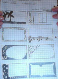
| Thumbnail Sketches 1 |
 |
| Thumbnail Sketches 2 |
 |
| Rough |
 |
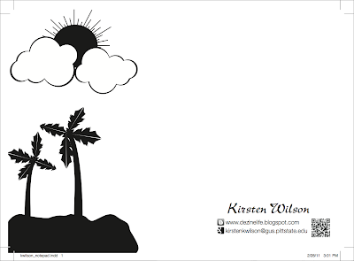
| Final Version |
With this project, I wanted to showcase my Illustrator skills. I created all the illustrations (sun, clouds, palm trees, etc...) in Illustrator.
I chose to use the Blogger icon and Google icon just to give them more information about how to contact me and to make it people more interested in looking up my blog. My idea is that, perhaps if people see the blogger icon they may think, "Oh, I have blogger...maybe I should check it out." And the QR code is a quick way for people who have smartphones to gain access to my blog.
I didn't want to crowd this page with to much text. It's a notepad and people are going to be using it to write things down... I don't want a bunch of text that I put on there to get in the way of that. I just went with simplicity on this project. I gave them enough information to be able to learn more about me or contact me but not so much text that it gets in the way of the functionality of the pad.
*QR Code and all Illustrator artwork was created by me, Kirsten Wilson. I had permission to use the Social Media Icons from the Share 1 server.


