Just some more playing around I did. Wanted a new wallpaper for my laptop. Created in Illustrator :)
Sunday, December 25, 2011
My Band
Just a fun little thing to do that I found floatin' around on Facebook. Just kinda gets your creativity flowing. :)
1. Go to wikipedia and hit random. The first random wikipedia article you get is the name of your band.
2. Go to quotationspage.com and hit random. The last four or five words of the very last quote of the page is the title of your first album.
3. Go to flickr and click on “explore the last seven days” Third picture, no matter what it is, will be your album cover.
4. Use photoshop or similar (picnik.com is a free online photo editor) to put it all together.
5. Post it with this text in the "caption" and TAG the friends you want to join in
Blog Header
This is a header I made for one of my other blogs. I used a Photoshop tutorial that I found online. Took a long time but I think overall I am pretty happy with the outcome. Needs a few tweaks and may add more to it but for now it will work :)
Sunday, December 4, 2011
Wednesday, November 16, 2011
Mag+ Project 3
Our third i-Pad project gets a little more tricky and a little more in depth. For this project we had to have at least 4 pages, 1 link and either a video or slideshow. I did my project over Skrillex. I used information found in the October issue of SPIN magazine. I was making my layout to look like an electronic magazine issue.
 |
| Scrolling to the second page |
 |
| SKRILLEX.COM is a link that takes you to Skrillex's website |
 |
| Here I have placed the video for "First of the Year Equinox" |
Horizontal View
 |
| The video plays in both the vertical and horizontal orientations as seen above and below respectively. |
Mag+ Project 2
For our second project we were to focus more on pinning objects. Pinning tells objects which edge of the screen to seek when device orientation changes...in other words it tells objects where to move when you rotate the device from vertical to horizontal view. One of the main goals was to make words read one way in the vertical view and then another once you rotated to the horizontal view.
I did this project for an organization that I am very passionate about called To Write Love On Her Arms you can learn about it here: http://www.twloha.com/.
I did this project for an organization that I am very passionate about called To Write Love On Her Arms you can learn about it here: http://www.twloha.com/.
 |
| As you scroll the A-Layer up, information about the organization begin to scroll in to view. |
Horizontal View
 |
| Here you can see how the words change position in the horizontal view. 'Love' is now on bottom and 'The Movement' is on bottom. |
 |
| To Write Love On Her Arms website |
 |
| Green Donate link sends you to the PayPal website |
 |
| Fears and Dreams link sends you to the Fears and Dreams page of the TWLOHA website. Here you can read about different people's fears vs. their dreams. |
 |
| The Storytellers link takes you to the Storytellers page of the TWLOHA website. Here you can learn about how TWLOHA is connecting with high schools around the country. |
 |
| Obviously the Twitter link takes you to TWLOHA's Twitter page. |
 |
| And the Facebook link takes you to their Facebook page. |
 |
| And there's a link to their MySpace page as well. |
 |
| As well as a link to their Tumblr page. |
 |
| The last link will take you to their Tumblr page that deals with College groups all over the country. |
Mag+ Project 1
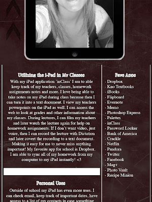
For our first project we just tested the waters and tried to learn about how the software works. The software comes with a template that allows you to build your layout with Adobe InDesign. With the software you have 3 layers:
 |
| As you scroll the page up, the A-Main Tower layer scrolls up to reveal my article about Utilization of the i-Pad. |
Horizontal View
Mag+ Software for the i-Pad
So there is this awesome new software out for the i-Pad called Mag+. I am absolutely in love with it!!
"Mag+ is the most flexible and efficient platform for publishing creative content on touchscreen tablets. Mag+ premiered on the first iPads in April 2010 with the award winning Popular Science+, and supports dozens of live titles in the iTunes Store. With its streamlined production system, powerful backend and feature-rich app framework, Mag+ is ideal for anyone— from magazine and book publishers to catalog marketers and design agencies—wanting to bring beautiful, immersive content to the millions using this new generation of digital devices. Built by the R&D task force of global publishing powerhouse Bonnier Magazine Group, Mag+ was spun out into its own company, Moving Media+, in 2011."
In my Layout and Design class (instructor: Chris Huitt) this semester we were given i-Pads and told to integrate them into our school and personal lives as much as possible....needless to say we were all extremely excited we took the class! For most of the semester, we have been working with the Mag+ software; learning how to use it and creating our own layouts for grades :) It has been an awesome semester!
For any fellow Pittsburg State students, Chris Huitt will be offering a class next semester called Mobile Media where you will be creating and publishing layouts on the i-Pad! Sounds like a great time to me....check it out if your interested!
To learn more about Mag+ check out there website!!!
http://www.magplus.com/
And for more tutorials and videos check out their Vimeo page!
http://vimeo.com/magplus/videos/sort:date
"Mag+ is the most flexible and efficient platform for publishing creative content on touchscreen tablets. Mag+ premiered on the first iPads in April 2010 with the award winning Popular Science+, and supports dozens of live titles in the iTunes Store. With its streamlined production system, powerful backend and feature-rich app framework, Mag+ is ideal for anyone— from magazine and book publishers to catalog marketers and design agencies—wanting to bring beautiful, immersive content to the millions using this new generation of digital devices. Built by the R&D task force of global publishing powerhouse Bonnier Magazine Group, Mag+ was spun out into its own company, Moving Media+, in 2011."
- Courtesy of the Mag+ Website
In my Layout and Design class (instructor: Chris Huitt) this semester we were given i-Pads and told to integrate them into our school and personal lives as much as possible....needless to say we were all extremely excited we took the class! For most of the semester, we have been working with the Mag+ software; learning how to use it and creating our own layouts for grades :) It has been an awesome semester!
For any fellow Pittsburg State students, Chris Huitt will be offering a class next semester called Mobile Media where you will be creating and publishing layouts on the i-Pad! Sounds like a great time to me....check it out if your interested!
To learn more about Mag+ check out there website!!!
http://www.magplus.com/
And for more tutorials and videos check out their Vimeo page!
http://vimeo.com/magplus/videos/sort:date
Thursday, August 11, 2011
Open House Tri-fold Brochure
Project Specs
tri-fold
8.5 x 11
no bleed
.25 in margins
8.5 x 11
no bleed
.25 in margins
.5 in gutters
This was a project I did while doing my internship at Pitsco.
version 1
 |
| inside flap back cover |
 |
| panel 1 panel 2 panel 3 |
version 2
 |
| inside flap back cover |
 |
| panel 1 panel 2 panel 3 |
version 3
 |
| inside flap back cover |
 |
| panel 1 panel 2 panel 3 |
Final Version
 |
| inside flap back cover |
 |
| panel 1 panel 2 panel 3 |
Tuesday, June 21, 2011
Dezine Life Logo
I love keeping up this blog and sharing everything with you guys...and I love having an online portfolio that employers can look at it. But most of all, I love to be able to see all of my projects and how my talents can develop throughout my time at Pitt State.
However, I would like to eventually move on to my own website. So recently I have started thinking about logos for a website and I want to stick with the name "Dezine Life."
In my InDesign file I created three layers: 1. butterfly.ai file, 2. "Dezine Life", 3. "Dezine Life" copy.
On the second layer, I converted the font to outlines and then used the 'Delete Anchor Points' tool to delete the accent lines and cirles.
Then I used the 'Line Tool' to kind of "trace" over the lines and circles in the words on the third layer...making them separate objects from the words on the second layer.
Then I deleted the third layer altogether. Which left me with the butterfly layer and the layer that contained the words and the accents.
So now I am able to change the colors of the accents but keep it looking like one font. Love being able to play around with the colors!
I'm still pretty new at using all this software so for all I know there was an easier way to do this and so if anyone knows that way feel free to shout out a comment and give me some pointers! Thanks!
However, I would like to eventually move on to my own website. So recently I have started thinking about logos for a website and I want to stick with the name "Dezine Life."
Design 1
- Font: Amadeus
- Butterfly created in Illustrator
In my InDesign file I created three layers: 1. butterfly.ai file, 2. "Dezine Life", 3. "Dezine Life" copy.
On the second layer, I converted the font to outlines and then used the 'Delete Anchor Points' tool to delete the accent lines and cirles.
Then I used the 'Line Tool' to kind of "trace" over the lines and circles in the words on the third layer...making them separate objects from the words on the second layer.
Then I deleted the third layer altogether. Which left me with the butterfly layer and the layer that contained the words and the accents.
So now I am able to change the colors of the accents but keep it looking like one font. Love being able to play around with the colors!
I'm still pretty new at using all this software so for all I know there was an easier way to do this and so if anyone knows that way feel free to shout out a comment and give me some pointers! Thanks!
Subscribe to:
Comments (Atom)


