Tuesday, June 21, 2011

Dezine Life Logo

I love keeping up this blog and sharing everything with you guys...and I love having an online portfolio that employers can look at it. But most of all, I love to be able to see all of my projects and how my talents can develop throughout my time at Pitt State.

However, I would like to eventually move on to my own website. So recently I have started thinking about logos for a website and I want to stick with the name "Dezine Life."


Design 1
  • Font: Amadeus
  • Butterfly created in Illustrator
I loved the font but I wanted something more versatile...I wanted to be able to have the font be one color and the cute accents in the font to be other colors.


In my InDesign file I created three layers: 1. butterfly.ai file, 2. "Dezine Life", 3. "Dezine Life" copy.

On the second layer, I converted the font to outlines and then used the 'Delete Anchor Points' tool to delete the accent lines and cirles.

Then I used the 'Line Tool' to kind of "trace" over the lines and circles in the words on the third layer...making them separate objects from the words on the second layer.

Then I deleted the third layer altogether. Which left me with the butterfly layer and the layer that contained the words and the accents.

So now I am able to change the colors of the accents but keep it looking like one font. Love being able to play around with the colors!

I'm still pretty new at using all this software so for all I know there was an easier way to do this and so if anyone knows that way feel free to shout out a comment and give me some pointers! Thanks!


Internship at Pitsco

So, I recently started an internship at Pitsco! I am absolutely loving the experience; the people, the environment...everything.

I've recently been assigned to do some artwork on a CD for a program they have at Pitsco.

So I shall soon be updating my blog with the information on all of that!

Monday, June 13, 2011

Airplane Dominoes - Package Design

Front

Top

Bottom

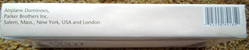
Sides

This is one of the first projects I ever got to do when I started the Commercial Graphics program at Pitt State. I do not have all information for the piece anymore and sadly have lost the files as well.

This is a brand of dominoes put out by Parker Brothers Inc. They were celebrating an anniversary and to celebrate, they wanted to give their domino package a new design that had an "old-fashioned" feel to it.

Tuesday, May 10, 2011

Personal Logo

All designers have their own personal logo/signature that goes on the pieces that they create...so naturally, I wanted to have my own! So, here it is....


This will be my personal logo that goes on the pieces I make.

This is a smaller, simpler version of my logo to put on smaller pieces that may not be able to accommodate the full logo.

This is the banner I chose to go with on my Blog and will eventually be the header on my own personal website that I am working on creating.

Thursday, April 28, 2011

Extra Credit - Harmony Printing


"What You May Not Have Learned During Your Stay Here"
John M. Castro 
Harmony Printing & Development Co.

When your in school your teachers spend a lot of time teaching you about these softwares and printing processes and the list goes on and on. Something we don't always get to learn....What it takes to survive in the workplace. 

We all expect that going into the real world is going to be a life changing experience...but we may not understand are the ways in which we should go about "securing" our job in where we work. 

First of all, you may not be the boss but you should still act like one. Treat the people you work with with respect so you can get their respect in turn, make sure you always clearly communicate what is you want/need someone to do and if something goes wrong anyways put it on yourself first. Don't point fingers. Think about what you could have done better and go from there.

Second, just because you are out of school and don't have a teacher to listen to anymore doesn't mean you shouldn't be listening. Communication is key in the workplace...and for others to communicate with you you need to be a good listener.

Also, remember that you should always be trying to "outdo" what you did last. Your boss loved your last project you went way beyond his expectations. Don't think you can slack on the next one....try to blow his mind even more with what you do next. Always be working towards continuous improvement. 

And lastly, don't EVER be afraid to try something new. This is your life...your future...so do it all! 

"Study without thinking and you're blind; think without studying and you're in danger." - Confuscious

Typography/Package Design/Signage


Final Project - Wedding Invitations

Project Specs:
7.25 x 5.6875 inches
unfolded= 18.25 x 7.25 inches
1 color black with .125 inch bleed and .25 margins
Index paper
7 pieces
1 = .51 cents / 500 = $255
File format provided: PDF

Purpose: to inform people about the wedding
Target Audience: friends and family
Call To Action: to get people to come to the wedding


Thumbnails of invitation package

Thumbnails of each piece

Thumbnails of each piece


This is the back of the Directions card


 For this project, we were able to choose to do any project we wanted. I chose to do wedding invitations because my mother is going to be getting married soon.

The invitation is 7.25 x 5.6875 inches when folded up. Unfolded, the piece is 18.25 x 7.25 inches. Inside the invitation there are 6 pieces: pattern background piece, Information about the bride and groom, RSVP, Reception and gifts information, Directions, and the envelope that the RSVP is returned in. There will be a 5.25 x 3 inch pocket inside the invitation that will hold pieces 3-7.

The fonts I chose to use were Chopin Script, Bellevue, Künstler Script and Times. I went with a black and white theme and these particular fonts because it gave the invitation a very formal and fancy feel.


*I, Kirsten Wilson, had permission to use the diamond pattern off of the Share 1 server.

Wednesday, April 6, 2011

Microsoft Tags


This is the tag I currently have for this blog.

Publication Ad - Taste of Home Magazine

Magazine Ad Specs
Project Specs:
7.875" x 10.5" file
.125 bleed
.375 margins
Incorporate Microsoft Tag, 4/C Raster, 2 Screen Tints, Stroked Type-Vector, and a Reverse
Cost: ????


Purpose: to share readers recipes
Target Audience: stay at home moms who need quick meal ideas 
Call To Action: to make people scan the Microsoft Tag

Thumbnails
Rough
Final Version

For this project, we were to choose any magazine we wanted and design an advertisement; adhering to the magazines ad specifications. I chose to use Taste of Home magazine and advertise Lean Cuisine meals.

The idea for the ad is to have lots of picture with minimal words. So, I went with a 4 color photo with full bleed as the background and used 3 additional photos to showcase the different types of meals Lean Cuisine offers.

Screen tint comes in to this piece with the orange box behind Lean Cuisine and with the black around the smaller pictures on the side. I incorporated the Stroked type and Reverse with the words Lean Cuisine. The Microsoft tag has also been included as an element in this project.


*I, Kirsten Wilson, had permission to use the stock photos off of the Share 1 Server.

Monday, April 4, 2011

Collegio Display Ad

Collegio Specs:
1 = 1.83
2 = 3.79
3 = 5.75
4 = 7.71
5 = 9.67
6 = 11.63 

3 col. x 7" = 21"
21 x $4 = $84.00

Project Specs:
File meets Collegio Ad size requirements
$100 budget
Incorporate a bitmap file (scanned in from hand drawing)
Incorporate the "Reverse" element 
5.75" x 7" file
.125 bleed
.25 margins
 
Purpose: to promote the Sunnyside Retirement Home
Target Audience: elderly people who need supervised care
Call To Action: to have people come to the retirement home to check it out
Thumbnails
Bitmap

*Rough (vertical)
Rough (horizontal)

Final Version

This piece is done in grayscale and has full bleed. The fonts I used were Chopin Script (Sunnyside) and Times New Roman (everything else). I chose to do a Reverse on the bottom because it help the ad to stand out from the rest on the page. I chose the image because it gives you a visual idea of what the ad is about.


 I chose to use a sun as my bitmap because it ties in with the name of the retirement home and helps grabs people's attention as they are scanning the paper and the other ads. Just wanted something that would grab their attention and direct them towards my ad.


*All work was created by me, Kirsten Wilson, as well as the bitmap element. I had permission to use the photo off of the Share 1 server.

Old vs New

BEFORE.......AFTER


On February 11, 2011, during the Academy Awards jcpenney revealed their new logo. The company reported that their department store was struggling with sales and they were going to have to close some stores. So they decided that they needed to try and pitch themselves as a more "modern" retailer and in an effort to do this they started accepting submissions for a new logo.

The new logo they chose came from a design student of the University of Cincinnati, Luke Langhus, who beat out more than 200 other entrants.

I think that the change from the old logo to the new is a good one. I believe that they have achieved a more modern look by using an all lowercase font


See full article from DailyFinance: http://srph.it/ev7CcS

Monday, March 7, 2011

Variable Data Direct Mail Piece

Project Specs
7x5 in postcard
1/8 in bleed
.25 in margins
CMYK color mode
Incorporate Raster (cob), Raster full bleed and drop shadow on type

Purpose: promote the iTunes Store
Target Audience: College students who listen to music - males/females
Call To Action: Use the promotional code for a free MP3 download and also to visit the apple site   
                             where you can download iTunes
    Thumbnails of Front
    Thumbnails of Back
    Rough of Front
    Rough of Back

    Final Version


    This piece is in done in CMYK color mode and has a full bleed on the front. The fonts I used were Rockwell and ATC Laurel. I converted my colors from spot to process because spot colors would cost more to have printed. I chose to use the color yellow because it is not a gender biased color.

    There are two versions of this file. One is for males and one is for females. On the front I used a COB of a person celebrating and on the back a Duotone Raster of a person with records surrounding him/her. Also on the back, I used a yellow vector box to give the back some color and to help tie in the color of the front of the postcard.


    *All Illustrator artwork was created by me, Kirsten Wilson, and I had permission to use the photos off of the Share 1 server.

    Tuesday, February 22, 2011

    Different Photoshop Formats

    Duotone Raster. Full bleed. Only save as eps. Color mode: Duotone
    •  300 Resolution
    • 1/8 bleed in Photoshop file
    • PS file measurements: 6.25 x 4.5 to fit a 6 x 4.25 postcard (to accommodate the bleed)
    Four Color Raster. Full bleed. Save as flattened eps or tif. Color mode: CMYK
    •  300 Resolution
    • 1/8 inch bleed in Photoshop file
    • PS file measurements: 6.25 x 4.5 to fit a 6 x 4.25 postcard (to accommodate the bleed)
    COB created using a clipping path in Photoshop. Only save as eps.
     Create a Clipping Path in Photoshop:
    1. Make final size adjustments (DO NOT size the file after you create your path)
    2. Using the pen tool, draw a path around the object you wish to take away from the rest of the image
    3. Have the Paths panel open. In the paths panel select Save Path.
    4. After you have saved the path, Create Clipping Path
    5. Save file as eps
    Grayscale Raster. Full bleed. Save as flattened eps or tif. Color mode: Grayscale


    *I had permission to use this photo. Downloaded from the iStockphoto folder on the PSU server.

    Self-Promotional Notepad

    Project Specs:
    Trims to 7 x 5 inches
    1 color black with .125 inch bleed
    Incorporate Grayscale Raster and 2 Vectors (not type)
    Padding and chip board back 
    50 sheets per pad
    Cost per pad: $3.25
    Estimated production time: 2 days
    File format provided:PDF

    Purpose: To promote myself and to show people my skills and what I can do with the Illustrator software. I want to get my name out there to possible future employers.
    Target Audience: People who like summertime and and the beach
    Call To Action: Get people to visit my blog and also to get my contact information out to people
    Thumbnail Sketches 1

    Thumbnail Sketches 2
    Rough
    Final Version


    With this project, I wanted to showcase my Illustrator skills. I created all the illustrations (sun, clouds, palm trees, etc...)  in Illustrator.

    I chose to use the Blogger icon and Google icon just to give them more information about how to contact me and to make it people more interested in looking up my blog. My idea is that, perhaps if people see the blogger icon they may think, "Oh, I have blogger...maybe I should check it out." And the QR code is a quick way for people who have smartphones to gain access to my blog.

    I didn't want to crowd this page with to much text. It's a notepad and people are going to be using it to write things down... I don't want a bunch of text that I put on there to get in the way of that. I just went with simplicity on this project. I gave them enough information to be able to learn more about me or contact me but not so much text that it gets in the way of the functionality of the pad.

    *QR Code and all Illustrator artwork was created by me, Kirsten Wilson. I had permission to use the Social Media Icons from the Share 1 server.